Taste is difficult to explain. Easier to recognise.
Arch Label already had a strong editorial eye. The opportunity was to make that point of view travel further through social.
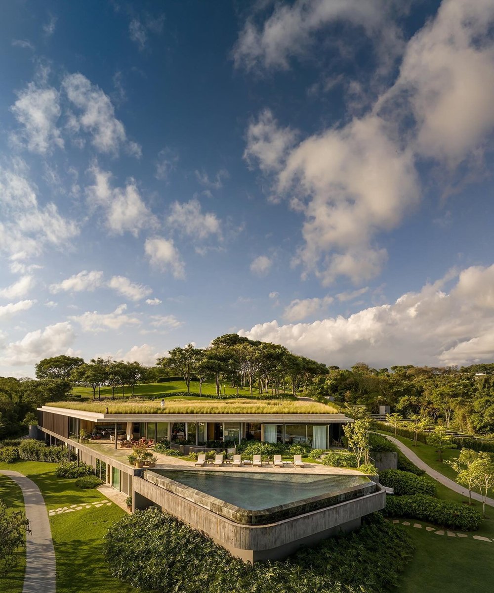
The publication had quality work, but its social presence felt more like a feed than a window into the brand.
We wanted it to feel more organic. More human. A living snapshot of the interiors, references, people and details that shaped Arch Label’s taste.
Something people could recognise without it feeling overly designed.
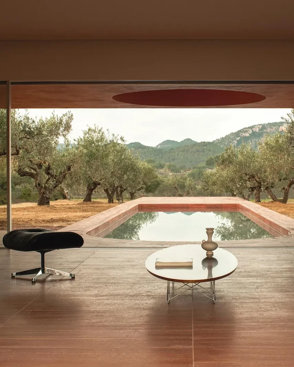
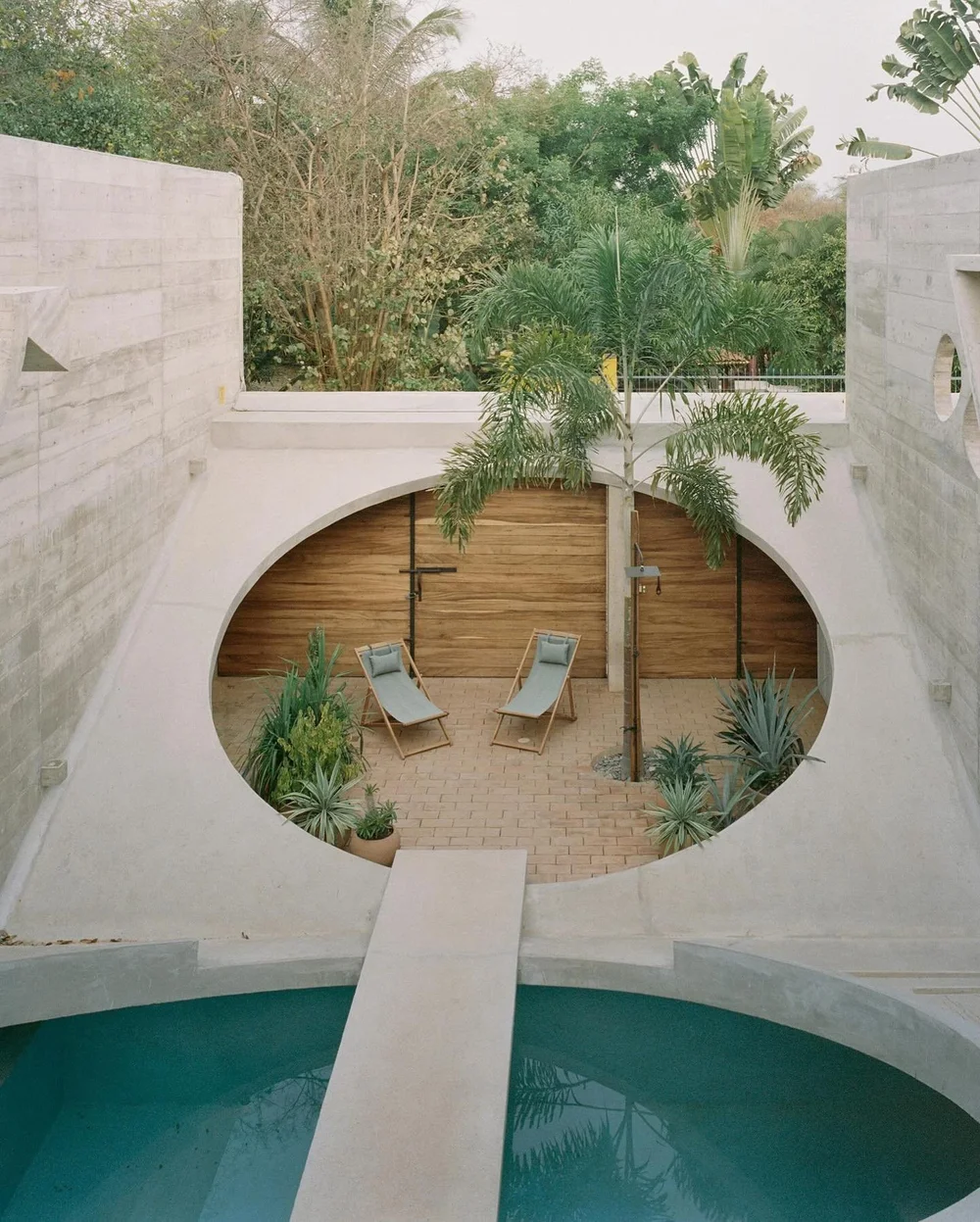
We developed the social direction around:
- Visual language and curation
- Editorial rhythm
- Audience growth
- Community interaction
- Ongoing performance review
The aim was to make each post feel part of the same world rather than a collection of separate pieces.
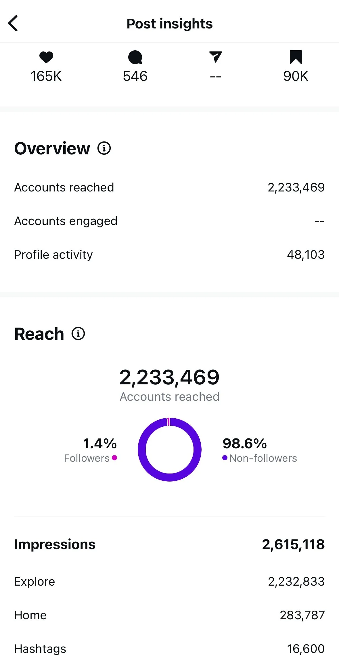
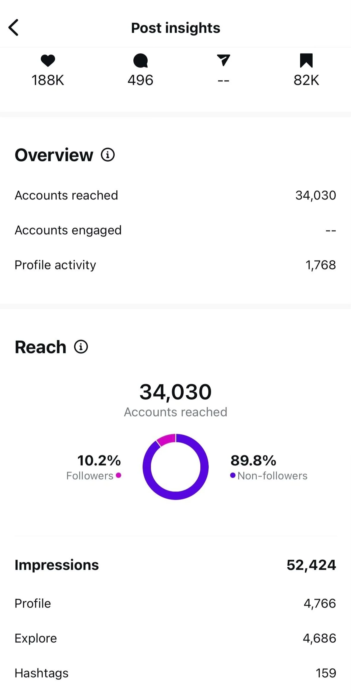
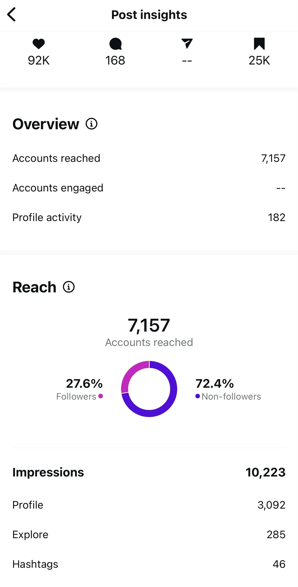
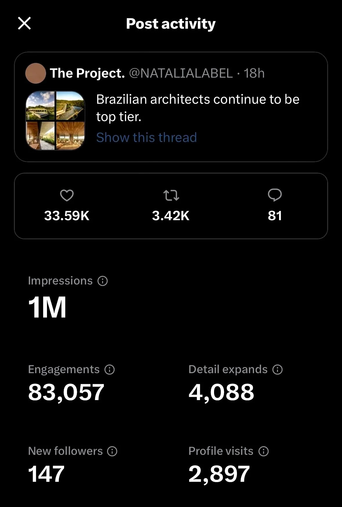
In two months, the account grew from 12,000 to more than 60,000 followers.
Over time, our work helped grow Arch Label’s wider social presence to more than 300,000 followers.
That growth put the publication in front of more design professionals, buyers and high-value customers, with social becoming a stronger source of enquiries and sales.