Taste is difficult to explain.Easier to recognise.
For Arch Label, the work was to make curation feel like authorship—so every encounter carried a distinct point of view.
A world, not a feed.
Arch Label is a London-based interior design magazine with a strong eye for architecture and spaces. In a crowded visual category, beautiful images alone were not the differentiator. The question was how to make its selection, language and recurring references unmistakably its own.
Editorial character in view.
IMAGERY / CURATION / CONTINUITY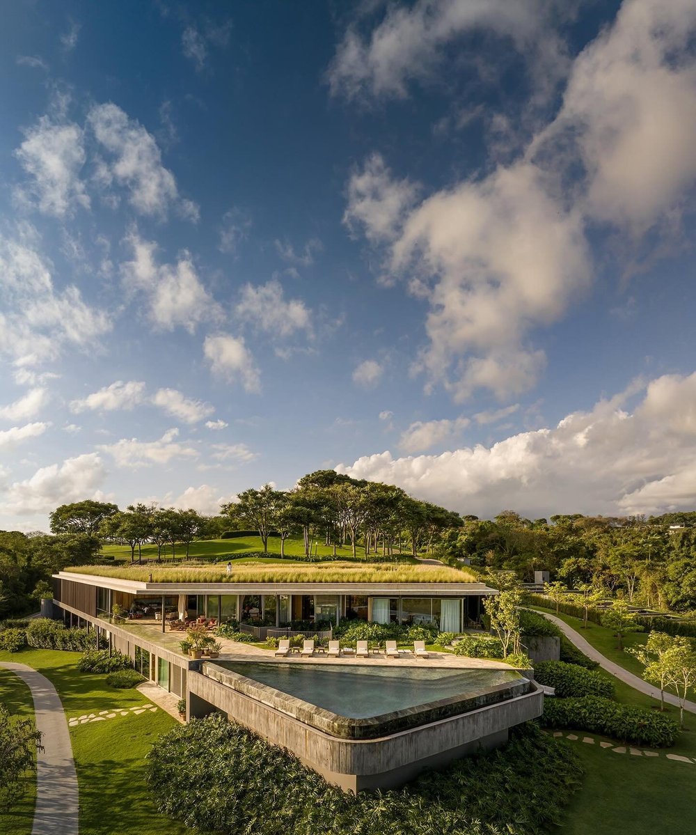
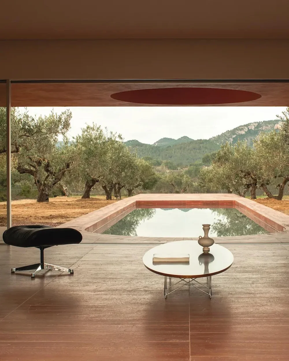
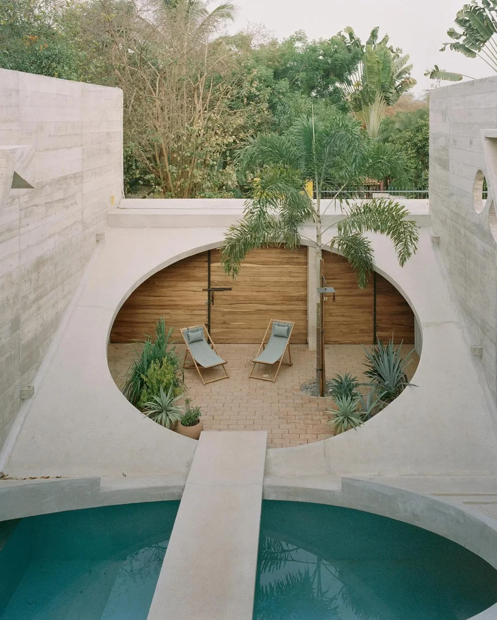
Recognition comes from a point of view.
A publication is remembered for how it sees. We treated Arch Label’s digital presence as an extension of that editorial judgment—not a separate machine for filling a posting schedule.
Visual direction, image selection, language and recurring references were brought into one rhythm. Each post could stand alone, while making the larger world more recognisable.
Make the curation feel authored.
Azana shaped the visual and editorial direction across Arch Label’s social presence, bringing consistency to the imagery, publishing choices and way the magazine met its community.
The change we wanted was qualitative: less like an account, more like a publication with a clear taste of its own.
View the original project ↗